Bring on the dancing tigers

Last week my two-year old daughter suddenly developed an aversion to dancing tigers. This wouldn’t be such a big deal if all of her diapers didn’t have dancing tigers on them.
This translated to a thirty-minute battle negotiation in which I finally convinced her that if she put on a diaper we could take a walk around the neighborhood before bath time. I was two quick sticky tabs away from success when the knock at the front door caused the dog to start barking, which made my daughter jump up in excitement and immediately declare no more dancing tigers.
Unfortunately for the person knocking at the door, the conclusion to this illogical sequence of events resulted in my immediate detest of whatever reason this person was knocking at my door. She introduced herself as Pamela from the US Census. Under my breath I cursed the pile of census mail that I had ignored over the past few weeks. If I had only taken the five minutes to fill out the questions I would be on a leisurely evening walk with a happy two-year old and a dancing tiger.
Pamela is very good at her job.
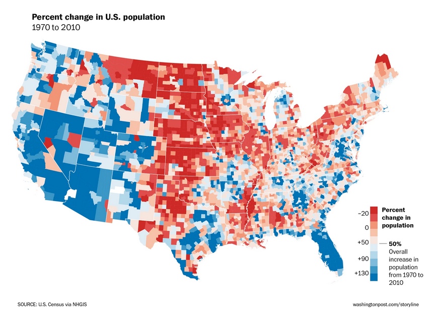
She persistently called me at 8:30pm every night until I picked up the phone (embarrassingly five nights later) to give her a mere 10 minutes of my time. I understand why census information is important, but after answering a few questions I soon forgot that I even had the conversation with Pamela. I’m almost positive that I would never have given it another thought until today when someone passed along this infographic:
Maybe a bit self-serving, but I find the infographic very interesting because I fall into the reported age range. If I follow my moves from the age of 25 to now (34) this map is very accurate.
In my mid-twenties, I moved away from the northwest region of Maine to Seattle, WA, and then later in my thirties back east to Burlington, VT. The accompanying story goes something like this: left small town New England for bigger opportunities in a growing west coast city but returned years later to be near family. Instead of returning back to small town New England though, I chose a growing city that attracts college students and young families alike.
 But what about that small town in the northwest region of Maine where the percent change in population and share of 25-34 year olds decreased? What will happen to that area if the population continues to decline? How do similar geographic areas attract young people and families and then keep them there? I don’t have answers to these types of questions, but I do find them interesting conversation points, especially in a classroom.
Visualizing data can certainly help students better analyze, understand, and discuss reported statistics and trends. And using data that they connect with can allow for more personalized and authentic learning opportunities. For me, I was drawn to this infographic because it told a story I can relate to. What kind of relevant data can you or your students collect, interpret, and illustrate? What else can you or they do with that data?
Looking back at the map, whether we stay in Burlington or in the future move to another area, we will more than likely continue to follow the trend, as long as there aren’t any dancing tigers.


Making data personally relevant improves engagement http://t.co/fsen5rZNkb #vted
Making data personally relevant http://t.co/vViQpCMBrC via @innovativeEd
Making data personally relevant http://t.co/VHn9SwZMHw